WholeScripts.com is an online platform that connects patients and practitioners through dispensing supplements. As a senior UX designer, I am responsible for conceptualizing and developing user flows, wireframes, and prototypes for new features, as well as monitoring site performance and making recommendations to optimize the platform.
My Role:
UX Research
Develop User Flows
Wireframes and Prototypes
Lead Usability testings
Deployment QA
Catalog Redesign Case Study
Problem to solve
Originally designed for a single brand with around 300 products, our catalog now offers over 90 brands and more than 1500 products due to shifts in our business strategy. However, this expansion has created challenges for our users to efficiently find the products they seek and discover new ones that cater to their health needs.
Objective
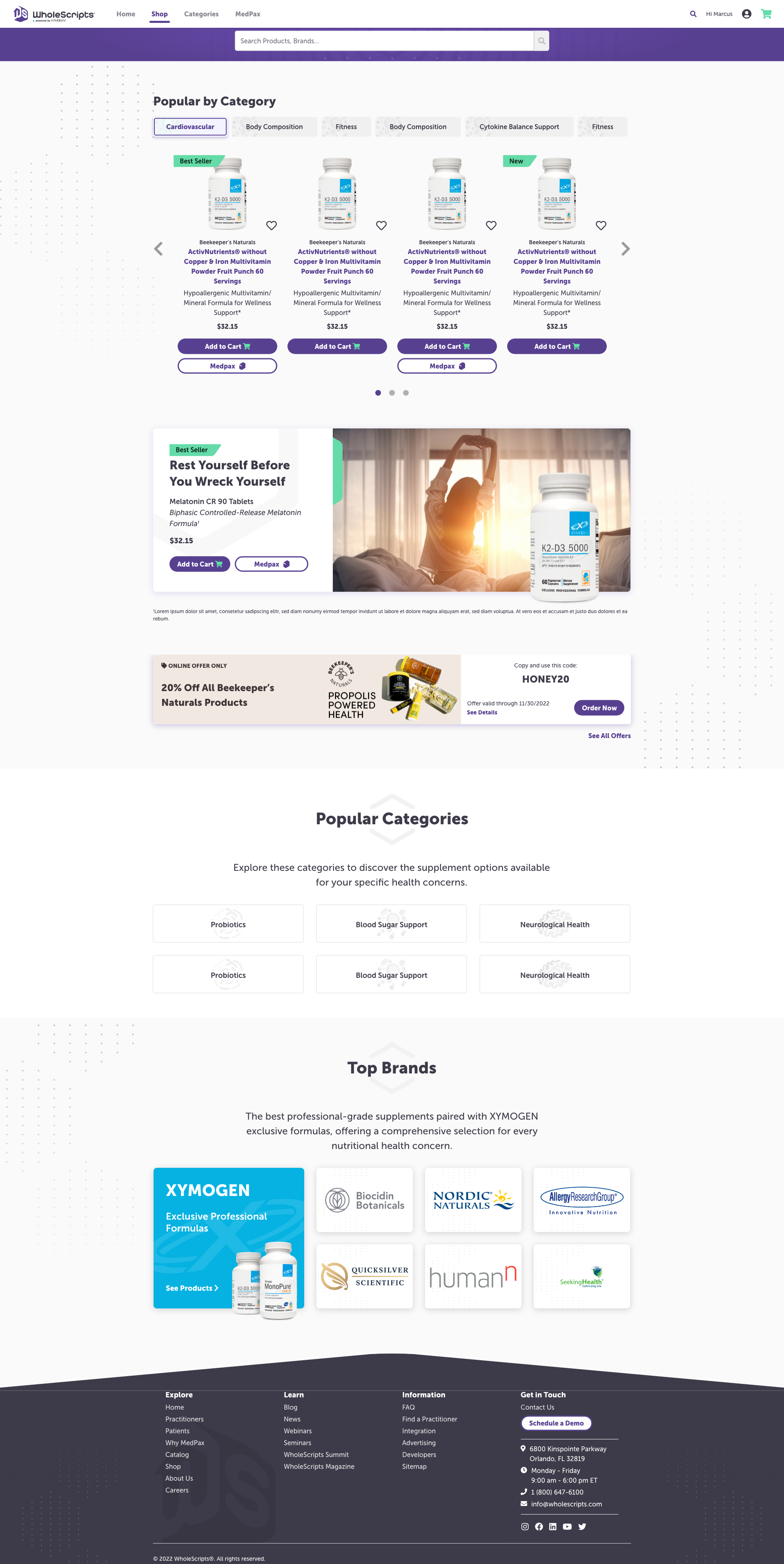
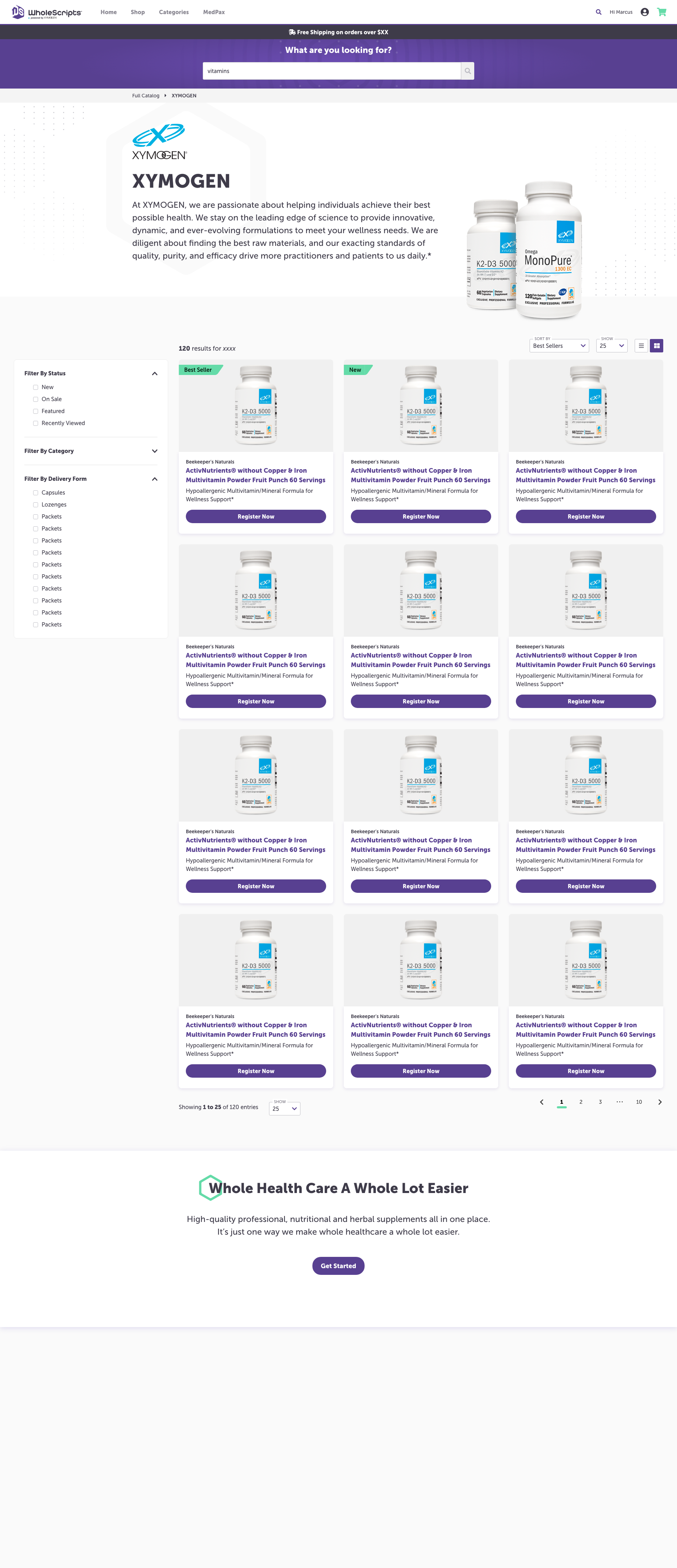
Redesign the Catalog page to enhance the customer’s ability to find products they are looking for while also facilitating the discovery of products that align with their health needs, ultimately leading to increased sales and orders.
Assumptions
• Customers have a desire to improve their health but struggle to identify the right products to purchase.
• Due to the extensive product range on WholeScripts, customers find it challenging to navigate and uncover the products that best suit their needs.
• Customers have limited familiarity with product names, ingredients, medical terminology, and their respective spellings, making an improved search functionality crucial for locating the right products.
Success metrics
• Increase in sales generated from the catalog page.
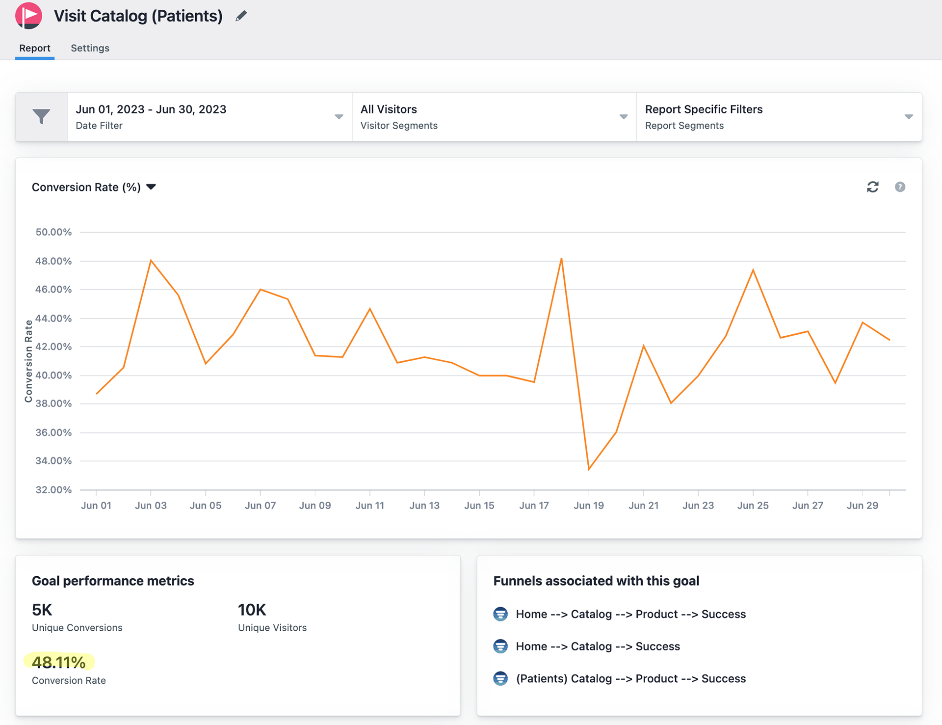
• Increase conversion rate from the product discovery.
Stakeholder Onboard
To secure stakeholder buy-in, I conducted a comprehensive survey of our current customers to gather feedback on their online purchasing and product discovery experiences on our site. I presented this data along with the existing catalog page’s traffic and conversion data, demonstrating the potential benefits and ROI of investing time and resources in this project.
Research
During the discovery phase, we conducted user interviews, competitive analysis, user persona creation, and analyzed survey and site data to understand user needs, pain points, and opportunities.
User Interview
Competitive Analysis
User Persona
Ideation
User Flows
Defining key features and content
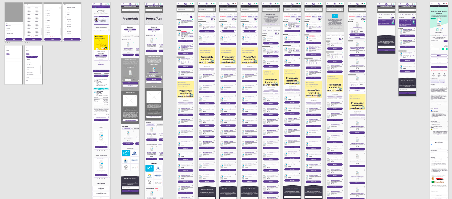
Low Fidelity Wireframes/Prototype
Design Validation
Moderated Usability Testing
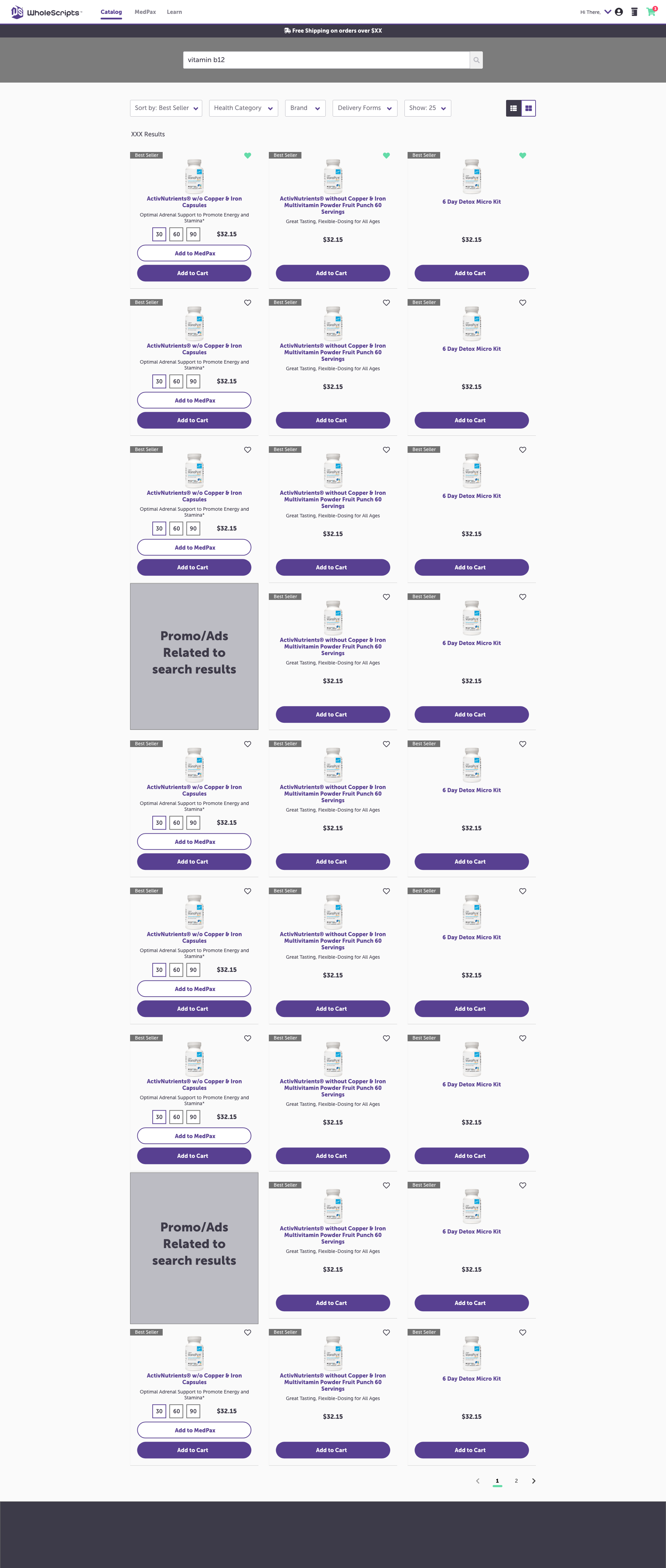
High Fidelity Wireframes

Outcomes
Overall, the traffic to the new catalog page increased by 20%.
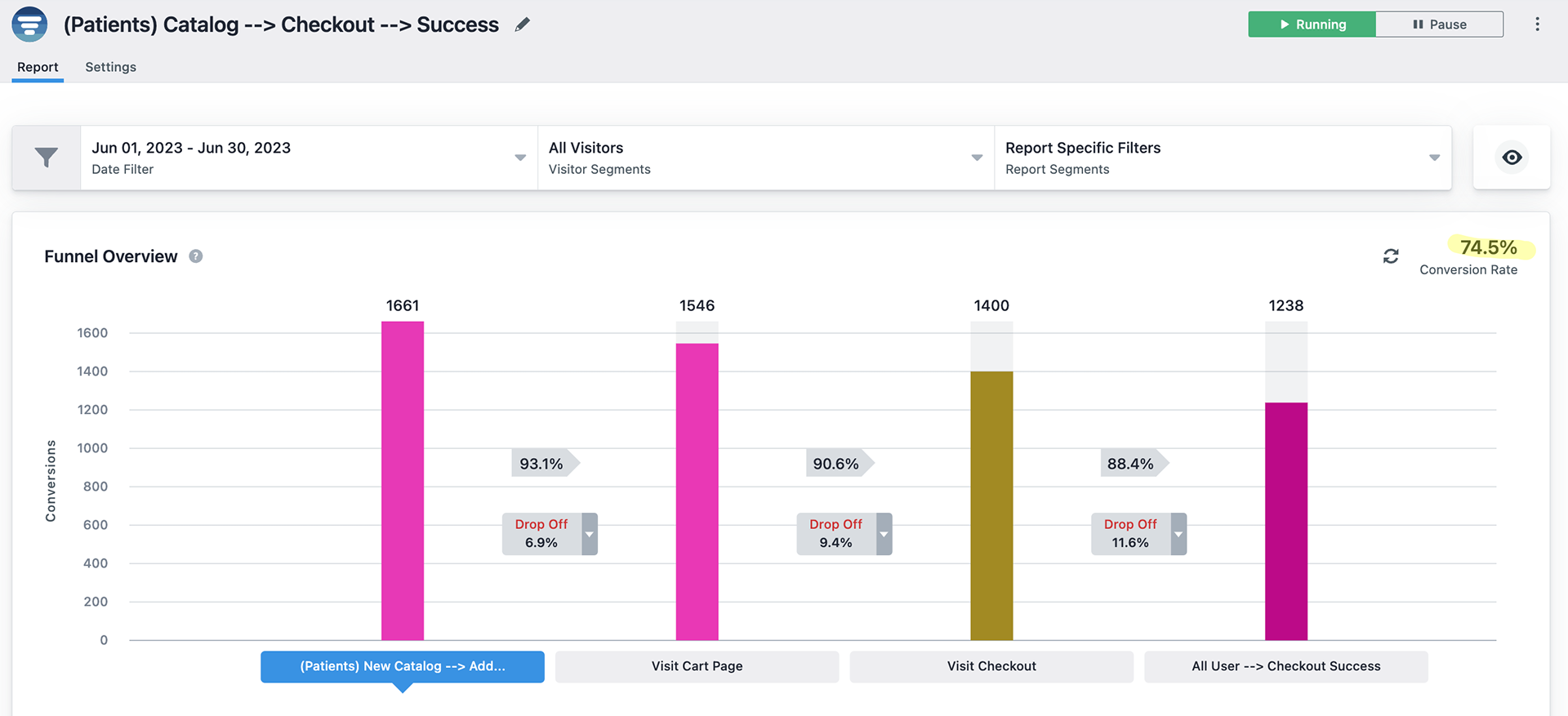
The conversion rate for users adding products from the catalog page to their cart and proceeding to checkout increased by 15%.
The Catalog Page Redesign project successfully addressed the challenges posed by our expanded product range. By improving product discoverability and enhancing the user experience, we achieved notable growth in traffic and conversions, leading to increased sales and customer satisfaction.
